Developer docs and app onboarding

Developer docs IA, API design review, and app onboarding at HubSpot

2019 to 2020

  • Shipped
  • Full version is private
Role
Primary UX designer for the developer docs, developer-experience reviewer for new public APIs, and designer of app setup and onboarding
What it is
A redesign of HubSpot's developer docs, API review, and app onboarding
Result
In an experiment, more developers made a first API call, in about half the time.
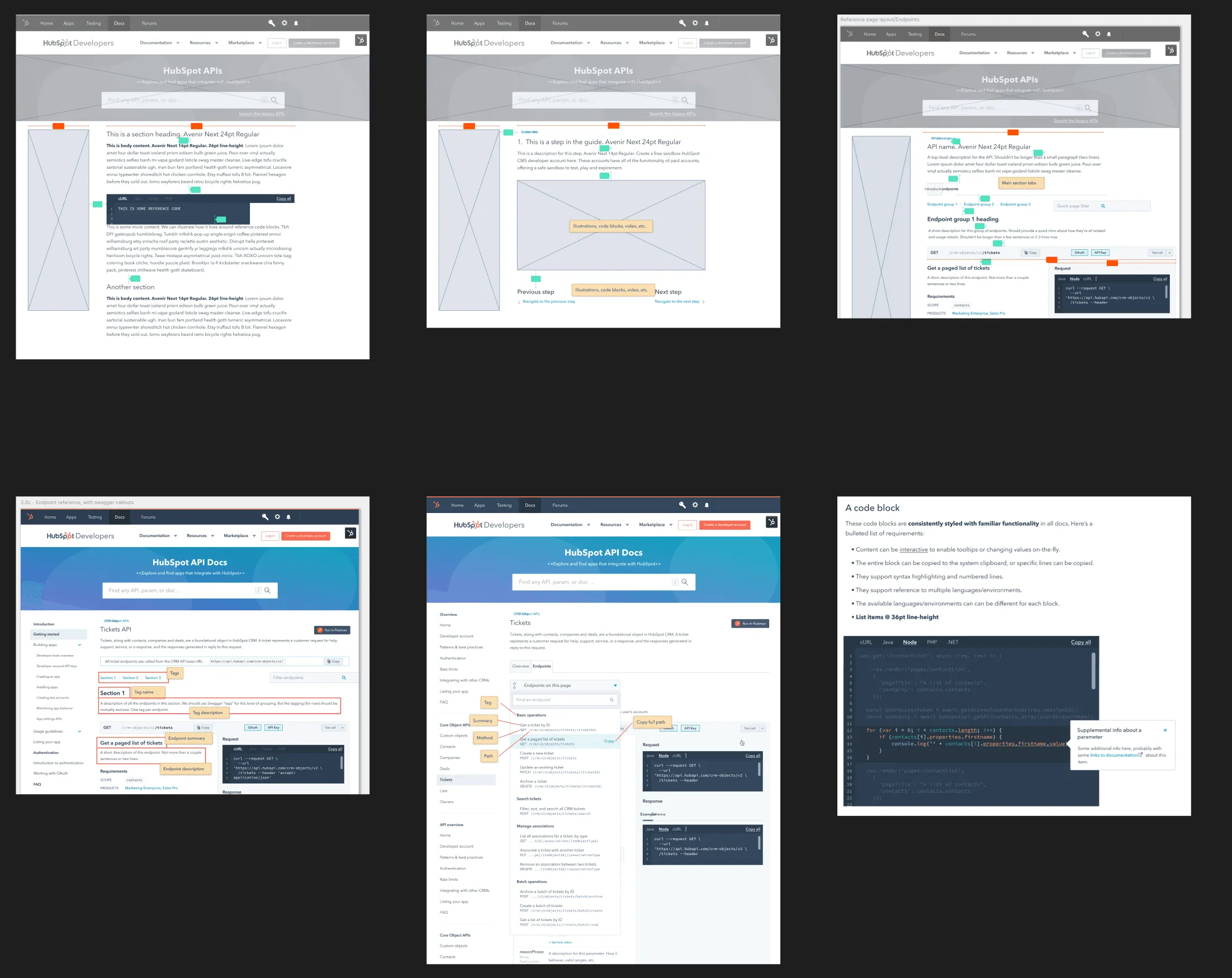
Six design frames in two rows. The top row has gray wireframes of a docs page template. The bottom row has the same template in full color, with endpoint reference, code blocks, and annotations.
Top row, gray wireframes. Bottom row, the same page template in full color. Guides and endpoint reference each got their own template. Names removed. View full size: Six design frames in two rows

In 2019, HubSpot’s developer docs had close to 500 pages, and poor usability and discoverability ranked #2 on our developer pain index. Endpoint design varied too.

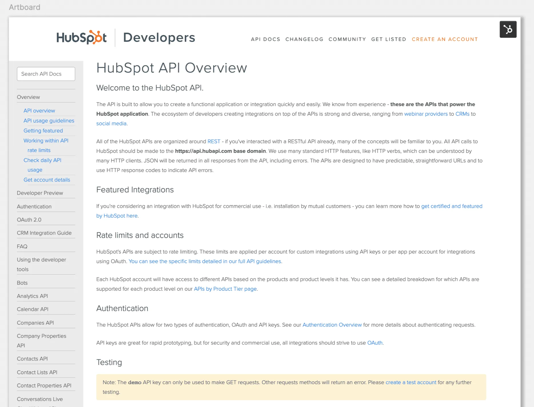
The old HubSpot API Overview page. A long list of API names runs down the left side, and the page text covers featured integrations, rate limits, authentication, and testing.
Before. One long list of APIs in the side nav, with guides and reference mixed together. View full size: The old HubSpot API Overview page
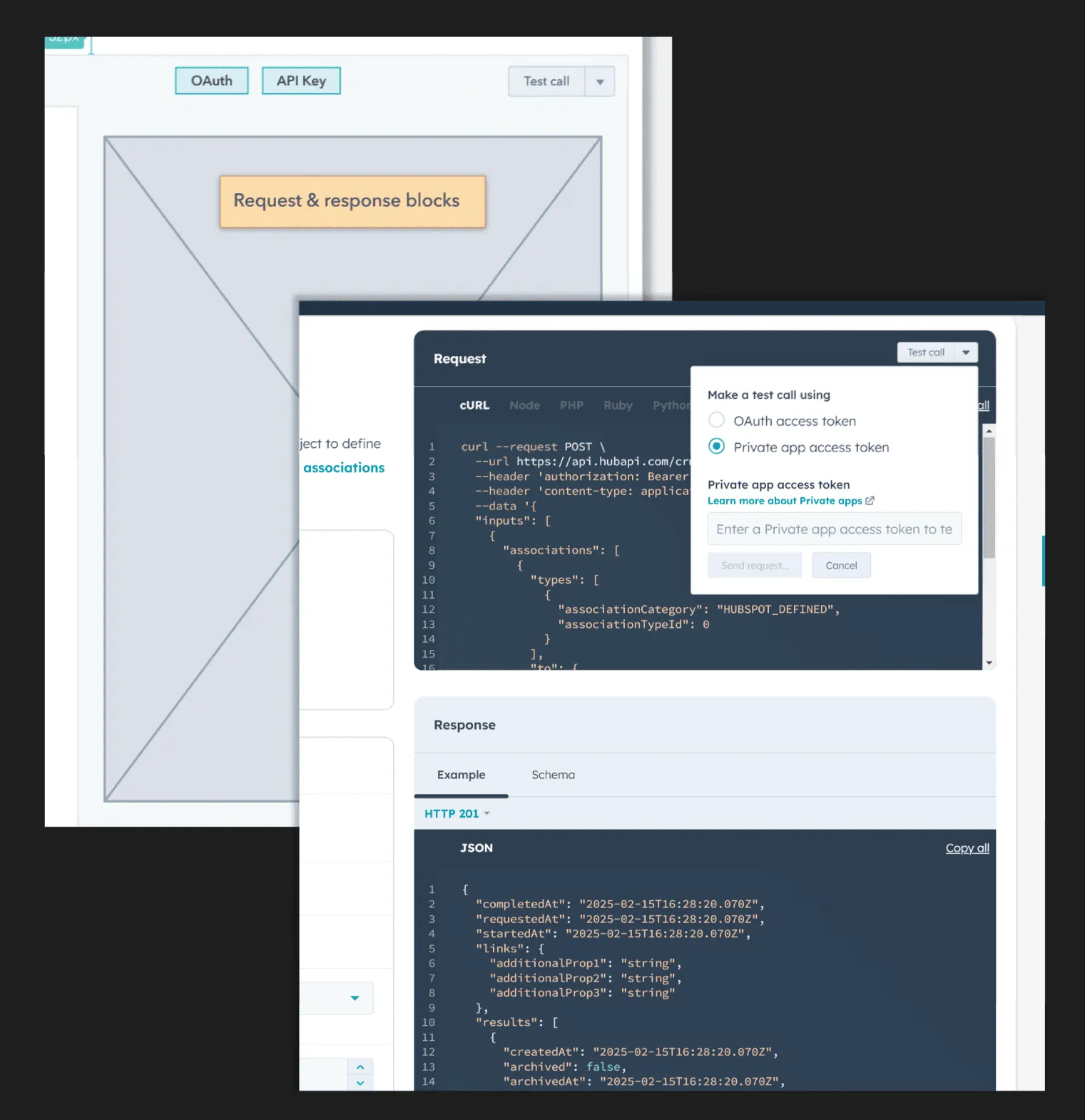
A spec for the request and response blocks on an endpoint page. The request block has tabs for cURL and other languages and a control to make a test call with an OAuth token or a private app token. The response block shows an example in JSON.
In the popover, a developer picks an OAuth or a private app access token and makes a test call from the docs page itself. View full size: A spec for the request and response blocks on an endpoint page
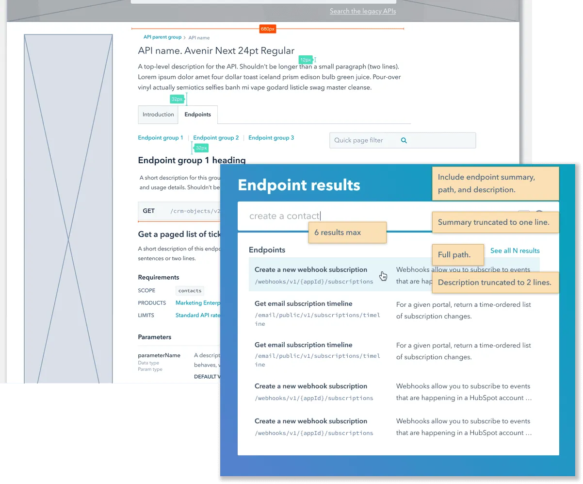
A wireframe of an API reference page with a search panel named Endpoint results over it. Yellow notes say what each result includes. A summary, the full path, and a description cut to two lines.
A spec for endpoint search in the new docs. The notes say what each result must show. View full size: A wireframe of an API reference page with a search panel named Endpoint results over it

With a content designer I split guides from endpoint reference and designed a new nav, page templates, and content modules. The docs shipped with CRM API v3, in preview in January 2020 and generally available in March.

How it was built

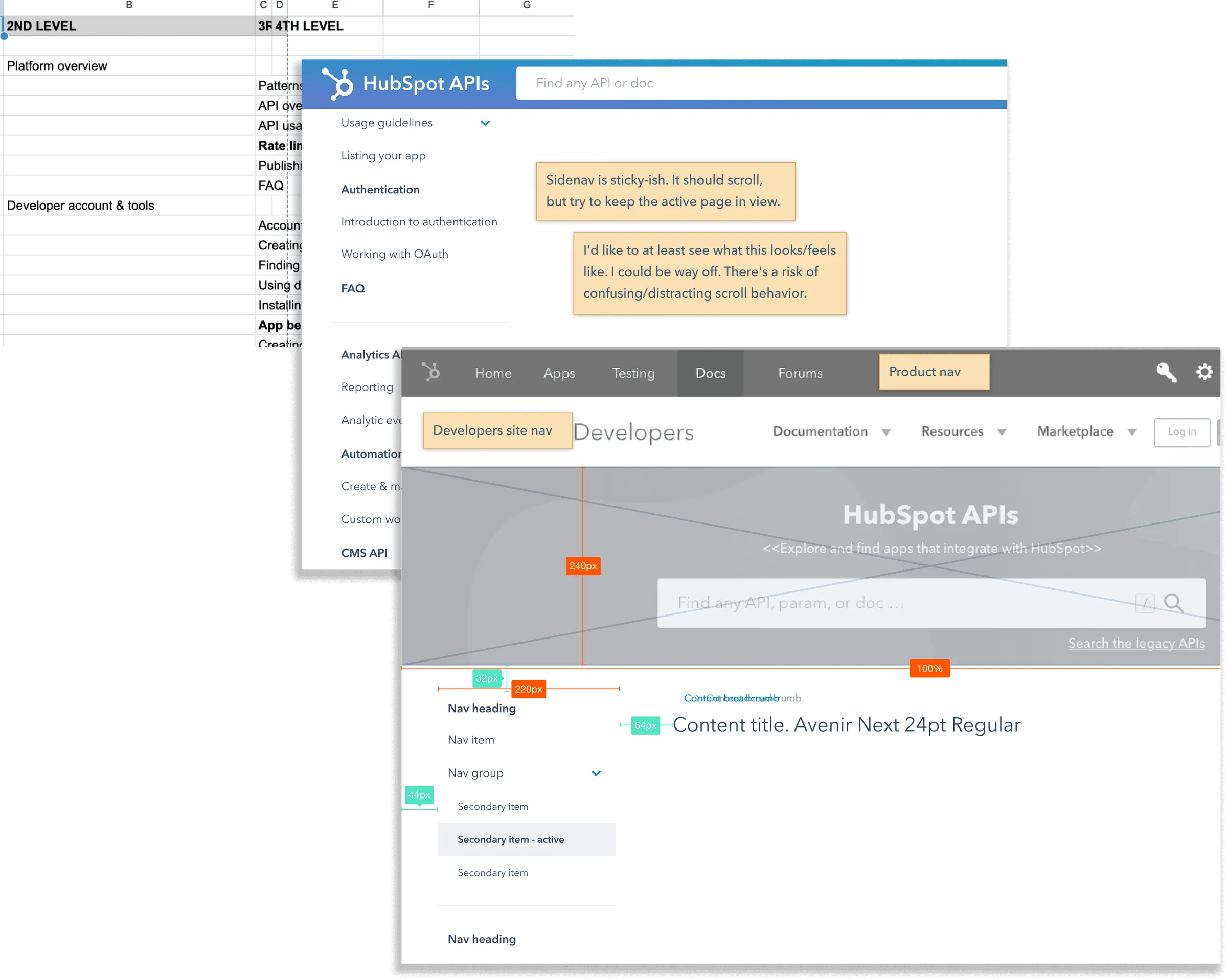
Wireframes of the new docs navigation, with yellow notes and red size marks. They show a side nav with groups, a top nav with a search field, and a content title.
Wireframes for the new nav, with my notes to the team on the open questions. I researched the docs four ways: a tree test, open and closed card sorts with a UX researcher, developer interviews, and usability sessions on the new design. View full size: Wireframes of the new docs navigation, with yellow notes and red size marks

Upstream, I wrote a template for logging API usability problems and a set of API design best practices, and reviewed new public APIs before release.

New app developers had to assemble an OAuth install URL by hand. I made it build itself, and added an onboarding path with a sample. In an experiment, more developers made a first API call, in about half the time. More in The First Mile.

The full version, with the numbers, is on a private page. Ask me for access.