Intrepid design system

Primitives, variables, and about a dozen components in Figma

2025

  • Course project
Role
Designer
What it is
A small Figma design system with light and dark components made from variables
Status
Course project, built in a five-week bootcamp
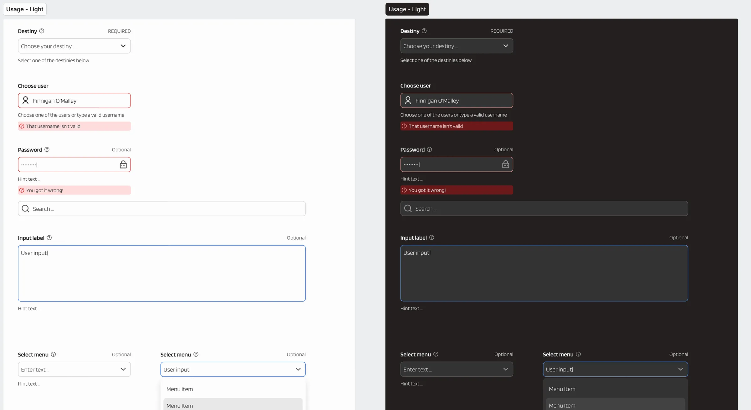
A sample form made from Intrepid components, shown twice, on a light surface and on a dark surface. It has select menus, a user field with an error, a password field, a search field, and a text area.
A sample form in the light and the dark mode. Both versions use the same components. View full size: A sample form made from Intrepid components, shown twice, on a light surface and on a dark surface

Intrepid is a design system I built in Figma in the five-week Design Systems Bootcamp on Maven. It has a four-hue color palette, the Blinker typeface, and about a dozen UI components.

Components

Alert, Tooltip, Button, Avatar, Form, and Navigation sit on top of the primitives.

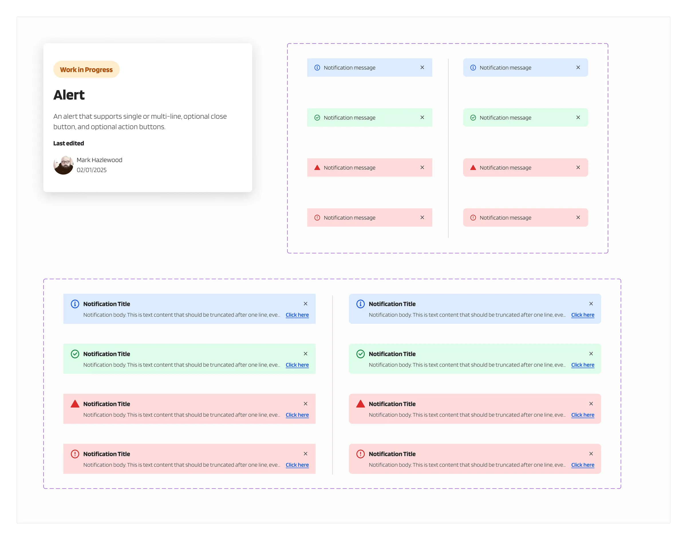
The Alert component page. Four colors of alert, for information, success, warning, and error, each as a single line and as a title with body text and a link.
Alert, in four tones and two sizes. The card on the left is the documentation that each component page starts with. View full size: The Alert component page
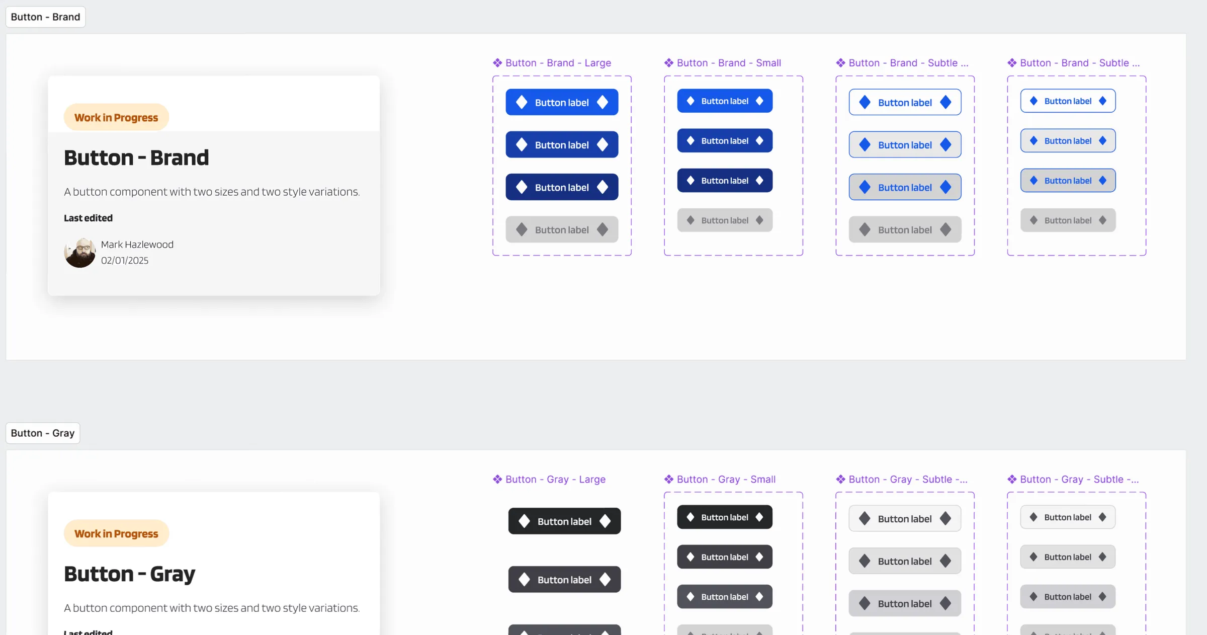
The Button component pages for the brand and gray buttons. Each shows large and small sizes, a solid and a subtle style, and default, hover, pressed, and disabled states.
Read down any column: default, hover, pressed, and disabled are drawn for every size and style of both buttons. View full size: The Button component pages for the brand and gray buttons
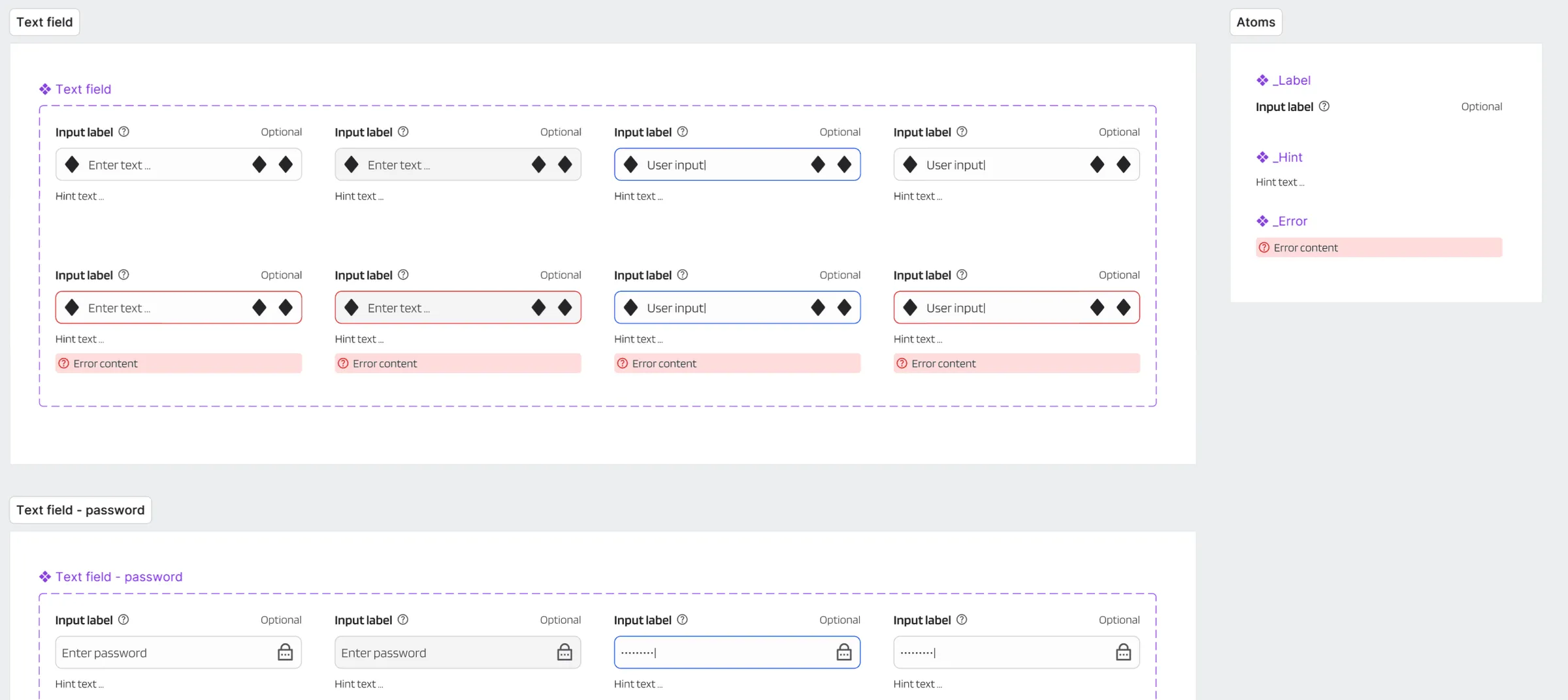
The text field component page. A grid of text fields and password fields in default, focused, filled, and error states, built from label, hint, and error atoms.
Text fields in default, focused, and error states. The Atoms panel on the right holds the label, hint, and error pieces that every field is built from. View full size: The text field component page

Light and dark from one set

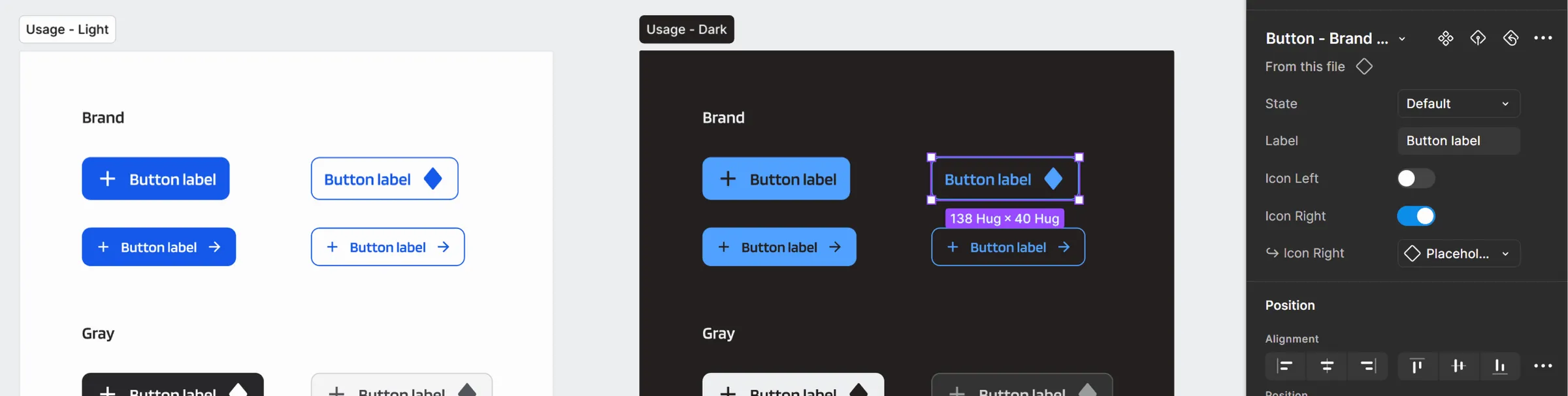
Because the color variables have modes, each component has a light and a dark version.

Brand and gray buttons from the Intrepid design system on a light surface and on a dark surface, with the Figma properties panel for one button beside them.
The same button components on a light and a dark surface. The color variables have modes, so no component has a separate dark copy. View full size: Brand and gray buttons from the Intrepid design system on a light surface and on a dark surface, with the Figma properties panel for one button beside them

How it was built

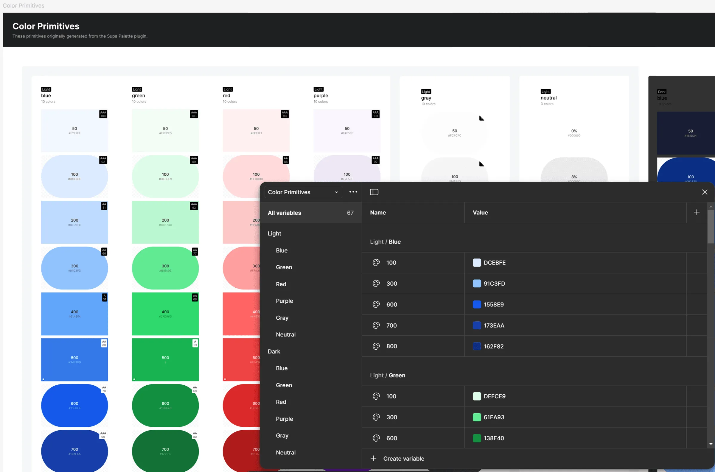
The color primitives page of the Intrepid library. Columns of blue, green, red, and purple swatches run from light to dark, with narrower gray and neutral columns beside them and a dark blue column starting at the right edge. The Figma variables panel lists each value under a light and a dark group.
The start of the build, a primitives library file, and the variables panel that holds it. Each hue has steps from 100 to 800 in a light and a dark set. The file also defines semantic color variables, type styles, grid layouts, and surface elevation effects. View full size: The color primitives page of the Intrepid library